EO Charging
A visual identity for the new look of EO Charging
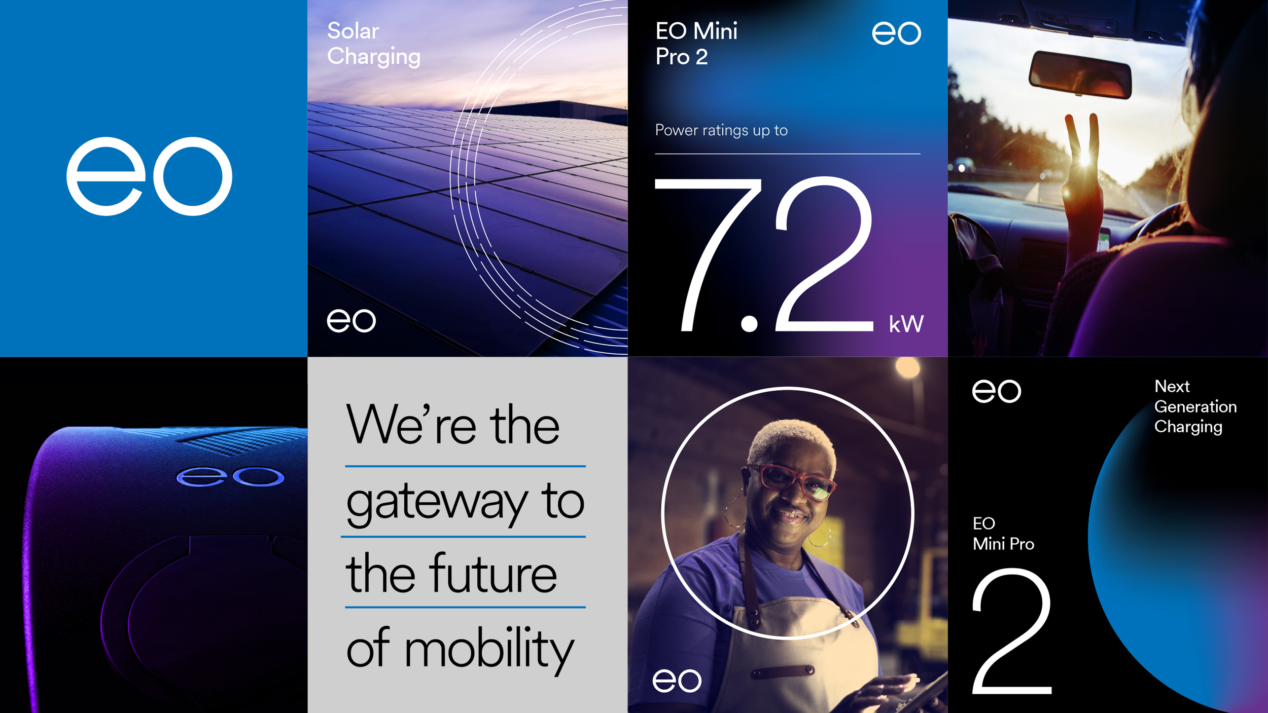
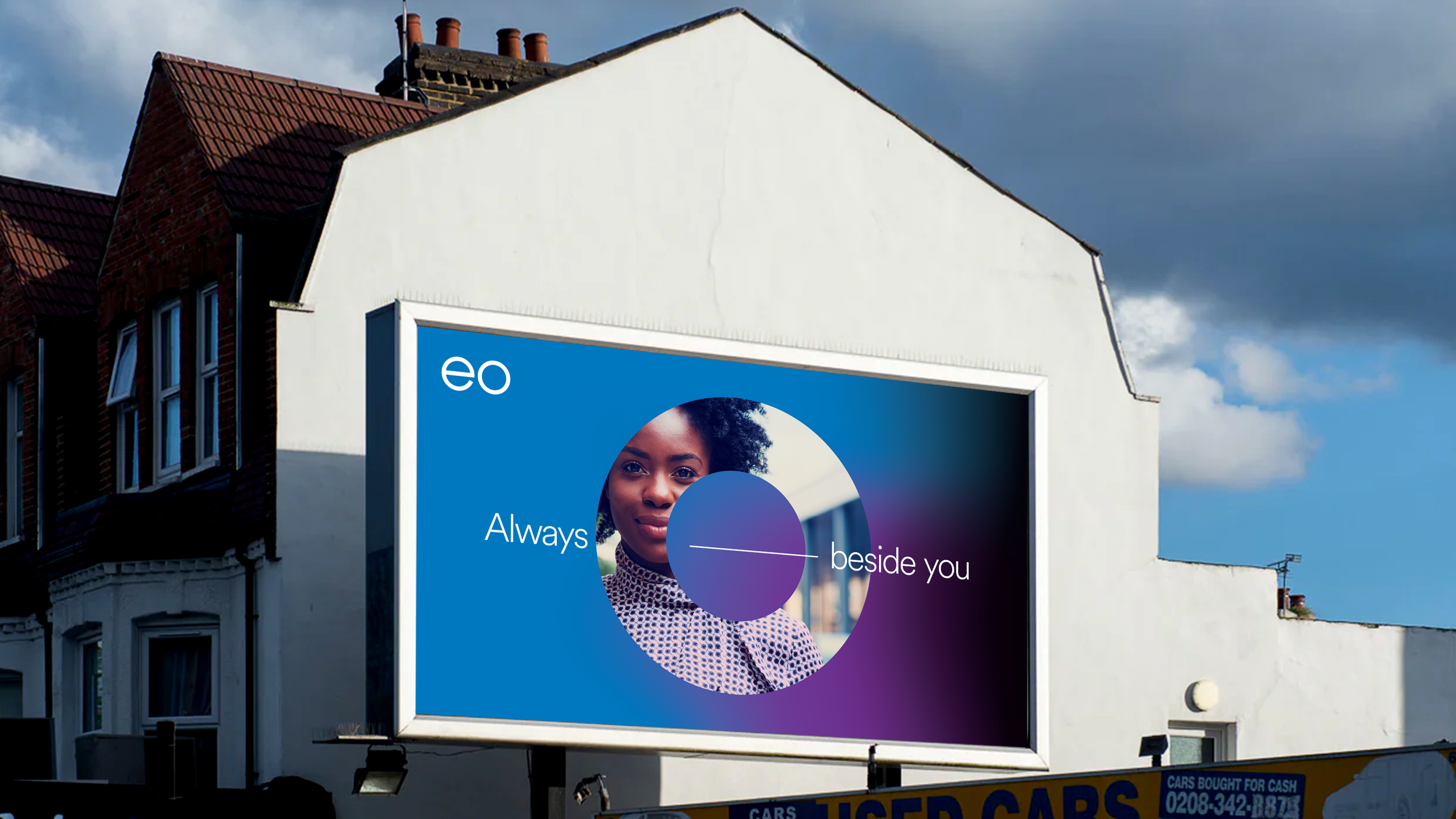
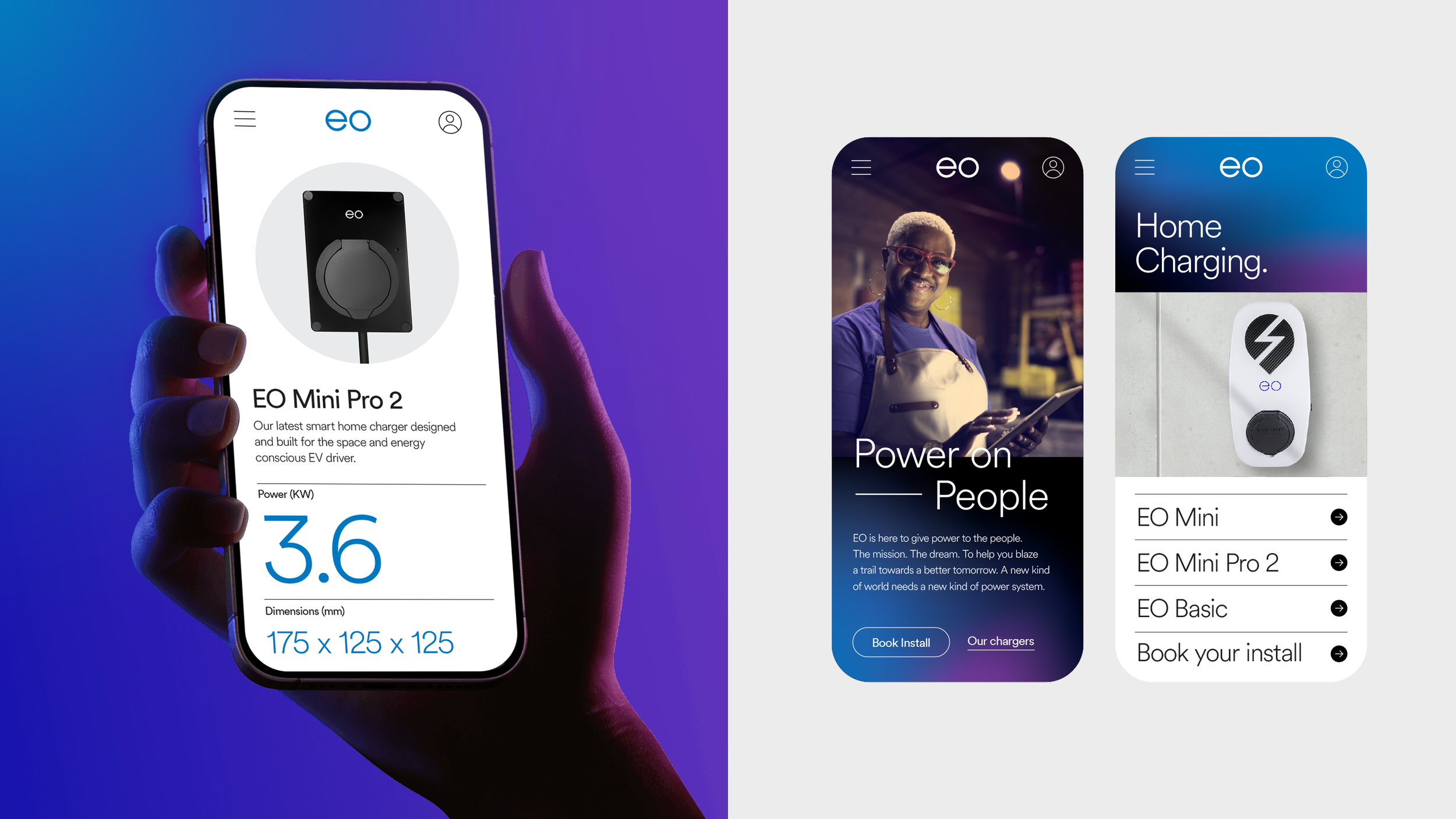
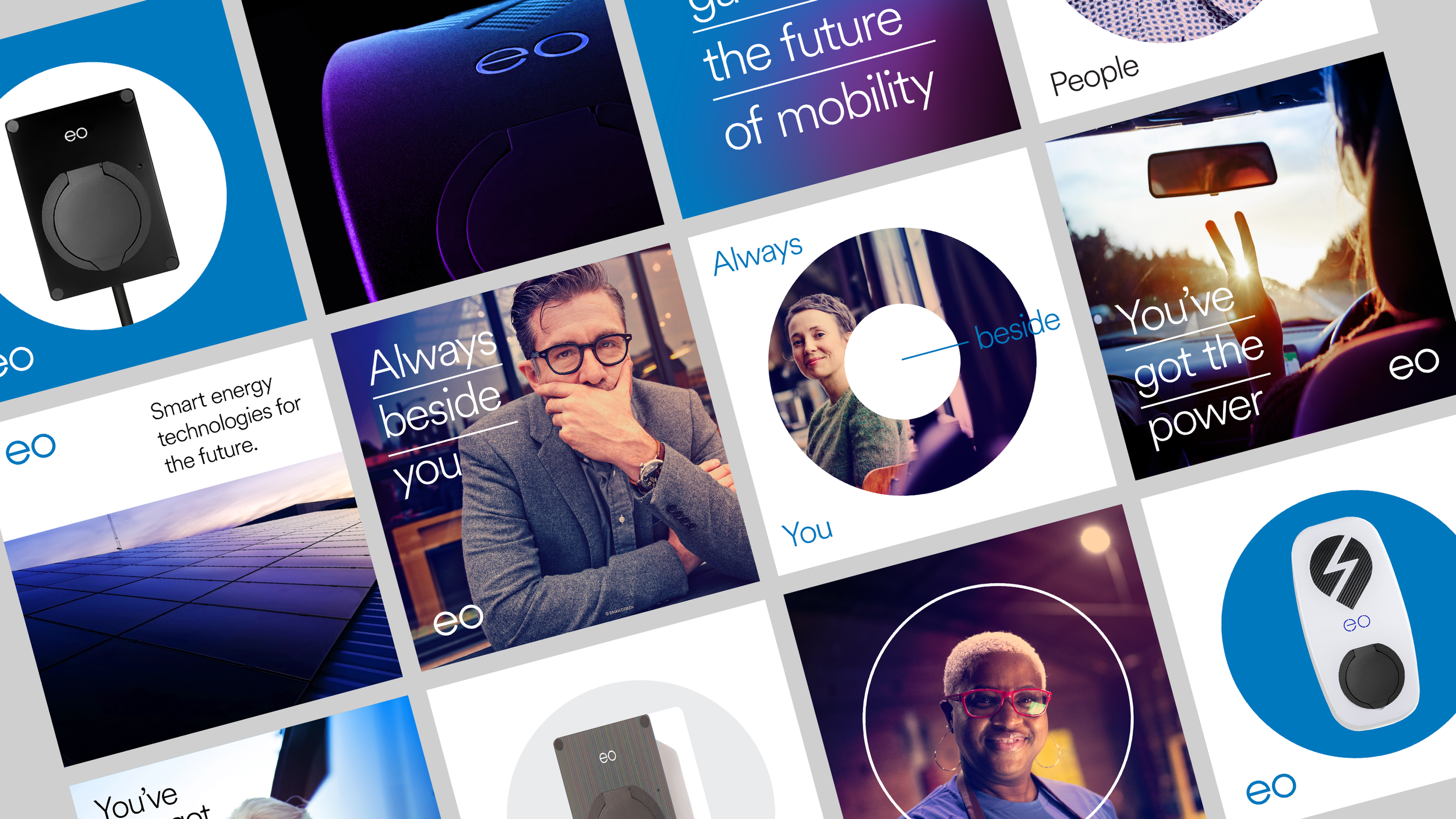
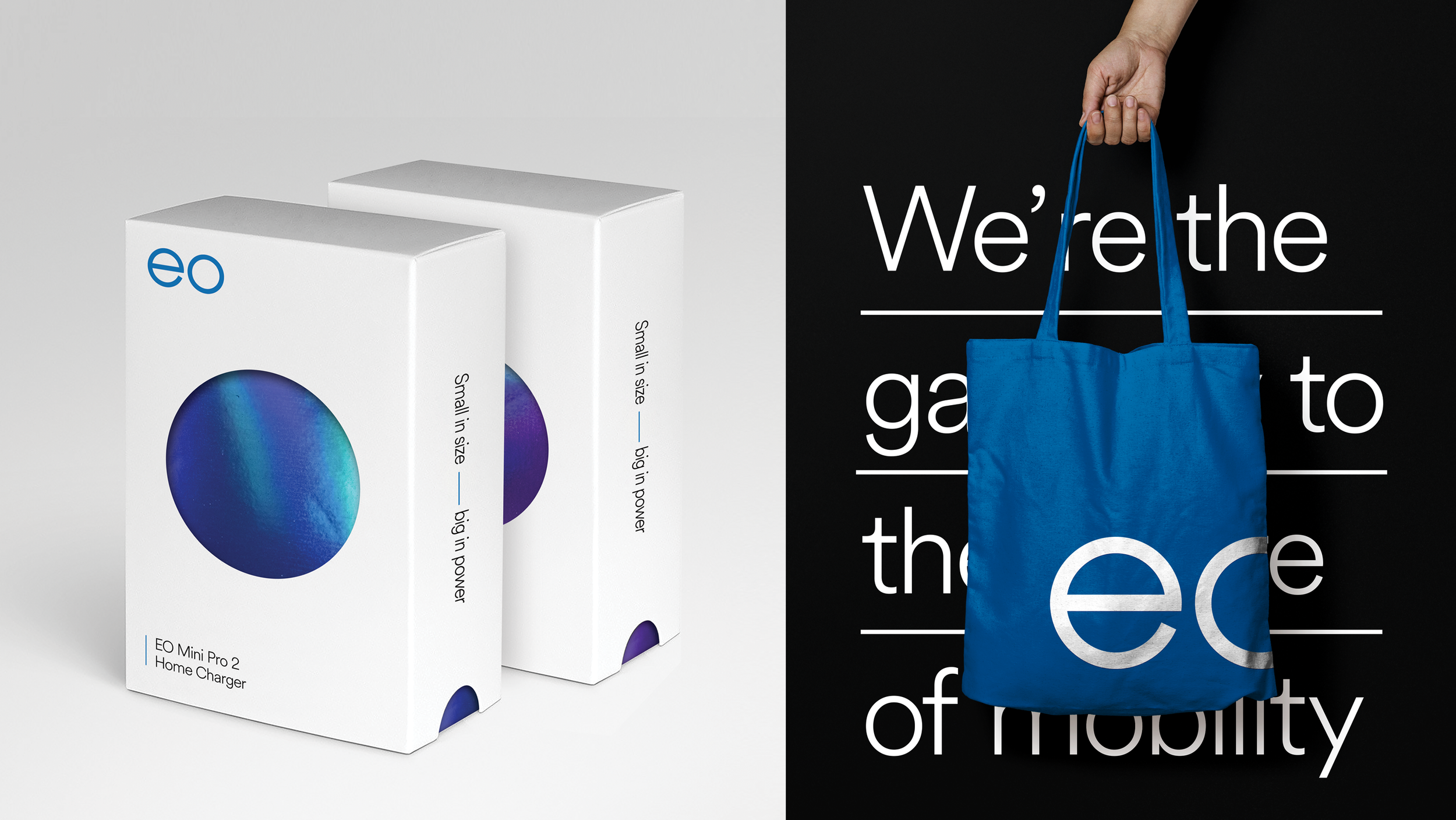
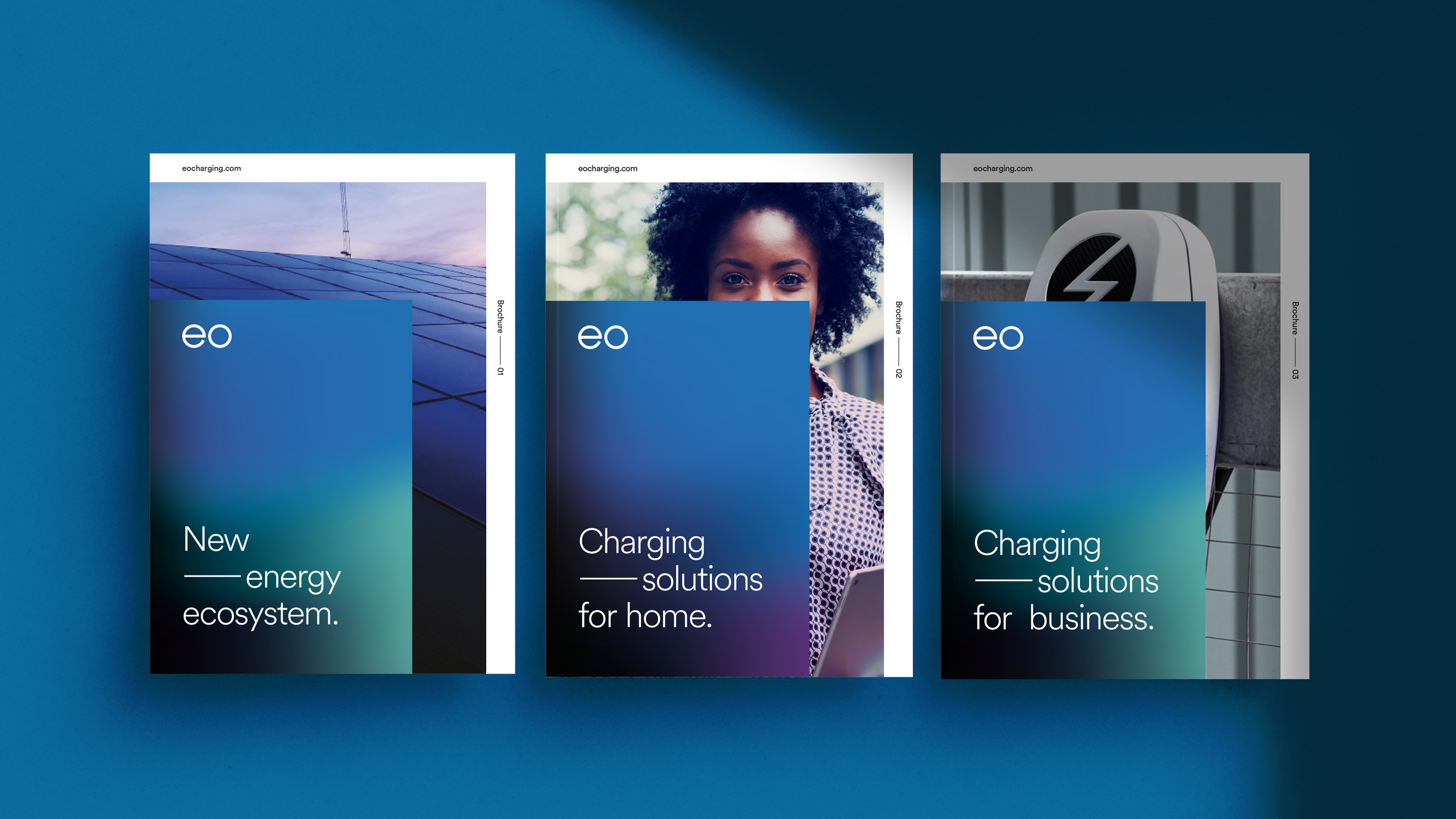
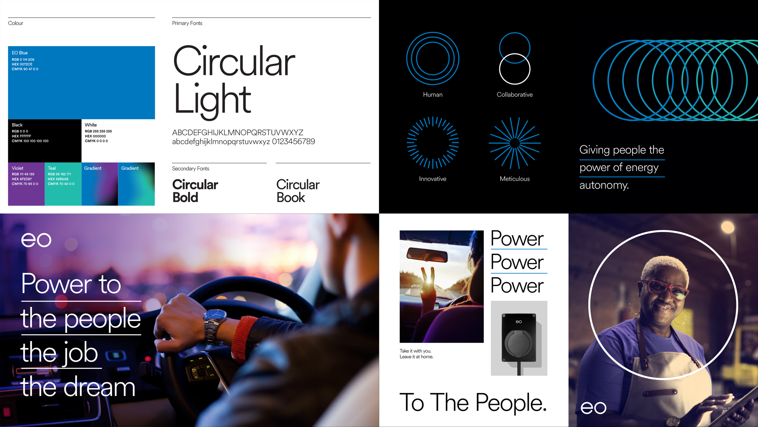
An innovative, trustworthy, and minimal visual language designed to strengthen brand recognition. The system builds on the circular forms of the letters “e” and “o” in the brand name, paired with clean straight lines that convey direction and forward thinking.
I led the project from initial concept through to the creation of a cohesive design system, ensuring it could be applied consistently across multiple touchpoints.
Agency
BBH London
Role
Creative & Design